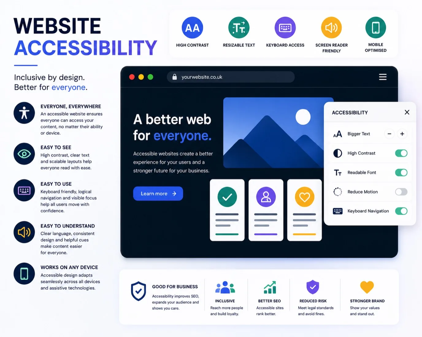
An accessible website is simply one that works for everyone, regardless of ability. That includes people with vision impairments using screen readers, users with motor disabilities navigating by keyboard alone, and people with hearing loss watching your videos. But here's the business case: accessibility improvements almost always improve the experience for all visitors, not just those with disabilities.
When you remove friction from your website, you remove it for everyone. Clearer text contrast helps older visitors and anyone on their phone in bright sunlight. Proper heading structure helps screen reader users and people scanning quickly on mobile. Videos with captions help those in noisy environments, non-native speakers, and anyone who prefers reading to listening. Good accessibility is invisible when it's done well, but the benefits compound across your entire audience.
Why Accessibility Matters to Your Business
You wouldn't lock half your customers out of a physical shop, yet many websites do exactly that. A significant portion of your potential audience, around one in five people, will have some form of disability that could affect how they use your site. Some of that traffic is already being lost silently, users clicking away when they can't navigate or read what you've built.
Beyond reach, accessibility often correlates with better conversion rates. Accessible sites tend to have clearer messaging, faster load times, better mobile experience, and simpler navigation. These aren't coincidences. Accessibility forces you to make hard choices about what actually matters, and those choices benefit everyone.
There's also the practical side: if you're serving UK customers, accessibility standards matter increasingly in tendering, public sector work, and larger B2B relationships. Building accessible from the start costs less than retrofitting.
The Core Elements of Web Accessibility
Accessibility rests on four principles: perceivable (users can see and hear your content), operable (users can navigate without a mouse), understandable (copy is clear and pages are predictable), and robust (your site works with assistive technology like screen readers).
On the perceivable front, this means sufficient colour contrast, text that isn't tiny, and meaningful alt text for images. A screen reader user needs to know what that photo contains. A colour-blind visitor needs your red/green status indicators to include text or icons too.
Operability is about keyboard navigation. A sighted mouse user can skip to the form they want, but a keyboard-only user needs to follow the same path. Your navigation should have a logical tab order. Links and buttons should be clearly focusable. Anything that takes three seconds to complete shouldn't happen automatically.
Understandable content uses plain language, consistent navigation, and clear error messages. "Invalid entry" is worse than useless. Tell users what went wrong and how to fix it. Use proper headings so assistive technology can outline your page. Structure matters more than fancy design.
Robustness means your HTML is clean, your form labels are properly associated, and your interactive elements follow standard conventions. A custom button-shaped div might look right, but a screen reader won't recognise it as a button.
How to Audit Your Current Site
Start by visiting your website as a keyboard-only user. Unplug your mouse. Can you use the site? Can you see which link you're on? If you can't, neither can many assistive technology users.
Next, check your colour contrast. Use a free tool like WebAIM Contrast Checker. Look at your navigation, buttons, and body text. Contrast should be at least 4.5:1 for normal text, 3:1 for larger text. Dark text on light background, or vice versa. Avoid grey on grey.
Try the WAVE browser extension (free, available for Chrome and Firefox). It highlights accessibility issues as you browse your own site: missing alt text, empty headings, form labels that aren't connected to their inputs. Most issues it catches are fixable in minutes.
Use a screen reader if you're serious. NVDA is free on Windows, JAWS is the paid standard. Listen to your site through a screen reader. Is your navigation clear? Does the reader announce buttons and form fields correctly? This is how your customers experience it.
Finally, test on real phones. Zoom in to 200 percent. Try landscape and portrait. See if your navigation still works. Accessibility and mobile responsiveness are deeply connected.
Building Accessible From the Start
If you're redesigning your site, accessibility is far cheaper to build in from the start than to add later. Accessible design and good design are usually the same thing.
Start with a semantic HTML foundation. Use proper heading hierarchy. Use nav, main, footer, and article tags so assistive technology understands the structure. Use form labels instead of placeholders. Keep forms simple and group related inputs.
For design, choose high-contrast colour schemes. Don't rely on colour alone to convey information. Make interactive elements obvious. Focus states should be clearly visible. Link text should make sense out of context, not "click here".
For images, write meaningful alt text. "Photo of coffee" is better than nothing, but "Cappuccino with latte art at Common Grounds cafe in Birkenhead" gives screen reader users actual information. For decorative images, use empty alt text or background images instead.
Test with real users. Run user testing with people who have disabilities. Accessibility issues become obvious fast when you watch someone navigate your site with a keyboard, screen reader, or magnification software.
Common Accessibility Mistakes to Avoid
Don't hide focus states. That outline you're tempted to remove is critical for keyboard users. Style it instead, make it visible and obvious.
Don't auto-play video or music. Give users control. Auto-playing video surprises and disorients people, especially those relying on audio for navigation.
Don't use colour alone to communicate. If you're using red for errors and green for success, add text or icons too. Same for graphs, maps, or status indicators.
Don't create PDFs as if they're print documents. Tag them properly, use real text instead of scanned images, ensure they're navigable by keyboard.
Don't assume your site only needs to work on desktop. Mobile accessibility is accessibility. Smaller screens, touch targets, different input methods. All of these affect how people use your site.
Tools and Standards
The Web Content Accessibility Guidelines (WCAG) 2.1 are the international standard. Aim for Level AA compliance as a minimum. Most accessibility issues at AA level also make your site better for everyone else.
Use these free tools: Lighthouse (built into Chrome DevTools), WAVE, Axe DevTools, and NVDA for testing. Most hosting providers and build tools have accessibility checks built in now.
For ongoing compliance, automated testing catches some issues, but many require human testing and judgment. Get in touch with us to audit and improve your site's accessibility, or learn more about how we approach web design for small businesses.
Frequently Asked Questions
Does accessibility cost more?
Not necessarily. Building accessibility in from the start is often cheaper than retrofitting. Even when it requires design adjustments, the improvements usually benefit your entire audience, making the investment worthwhile.
Will accessibility make my site look boring?
No. Some of the most beautiful, modern websites are accessible. Accessibility is about structure and clarity, not aesthetics. Your brand identity and visual design remain entirely yours.
How long does it take to make a site accessible?
A small business site can be audited in a few hours. Simple fixes (contrast, alt text, heading structure) might take a day or two. More complex work depends on your starting point. Accessibility is a process, not a one-time project.
Is accessibility a legal requirement?
In the UK, the Equality Act 2010 requires reasonable adjustments for disabled people. For businesses, this includes digital access. Public sector sites must meet WCAG 2.1 AA as standard. Best practice is to aim for accessibility regardless.
Who uses accessible features?
Everyone. Keyboard navigation helps power users and people with repetitive strain injuries. Captions help people watching in noisy spaces. Clear structure helps mobile users and people with cognitive disabilities. Think of accessibility features as benefits for all users, not special cases.