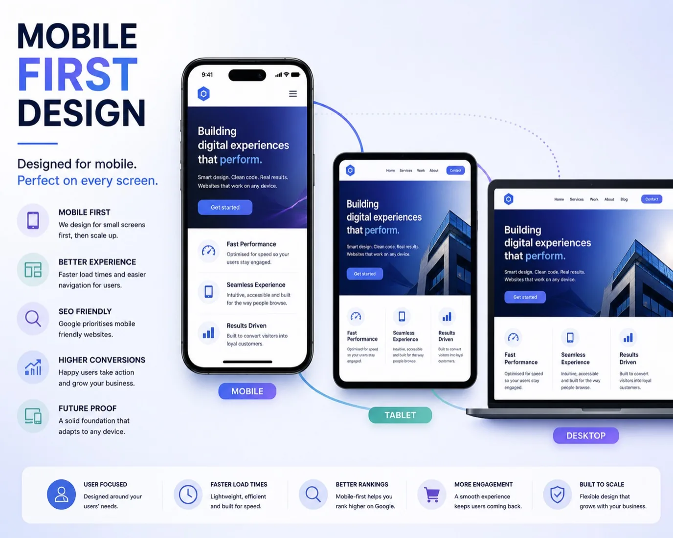
The majority of your customers access your website on a phone. Not a tablet in landscape mode or a desktop with a big monitor. A phone held in one hand, thumb scrolling, often distracted. If your website doesn't work brilliantly on mobile, you've already lost them. Mobile first design isn't a trend anymore. It's the baseline expectation.
Mobile first means designing your website starting with the smallest screen, then adding complexity as space allows. It's the opposite of how many businesses build: desktop first, then squashing everything down to fit a phone. That approach creates bloated, confusing mobile experiences. Mobile first forces you to make hard choices about what matters, and those choices almost always improve your entire site.
Why Mobile Matters More Than Ever
Most of your website traffic comes from mobile devices. If you're a service business, people are researching you on their commute or lunch break. If you're an e-commerce business, phone users are your highest-intent customers, researching before they buy. Getting mobile right isn't a nice-to-have, it directly affects your revenue.
Mobile first design also gives you better SEO. Google's algorithm now prioritises mobile versions of websites. A site that works poorly on mobile will rank lower in search results, even on desktop, because Google assumes anyone researching you will be on a phone.
Beyond traffic and ranking, mobile friendliness affects how people perceive your business. A clunky mobile site signals that you don't care about your customers. A smooth, fast mobile site signals that you're professional and modern.
The Core Principles of Mobile First Design
Start with the smallest screen and work up. Design your layout for a 375-pixel-wide phone first. Everything on that screen should be meaningful. No filler, no "nice to haves." What does your customer actually need to do? What problem are you solving? Start there.
Vertical scrolling should be your primary interaction. People expect to scroll down on mobile. They don't expect horizontal scrolling or complex gestures. Make your content naturally stack on a phone, then arrange it into columns as more space becomes available.
Touch targets matter. On mobile, your buttons and links need to be at least 48 pixels square. Small text links that work fine with a mouse cursor become impossible to tap accurately on a phone. Make your interactive elements generous and easy to hit.
Typography deserves care. Your body text should be at least 16 pixels on mobile. Smaller text is harder to read, causes zoom-in behaviour that breaks your layout, and signals carelessness. Headings should create clear visual hierarchy. Use spacing instead of tiny text to create layouts.
Performance is part of design on mobile. A slow site on desktop is annoying. A slow site on mobile is unusable, especially if your customer is on 4G. Images should be compressed and served in the right size. Code should be minimal. Layouts should be simple enough that the browser doesn't struggle to render them.
Designing Touch Interactions for Phone Users
Mouse users can hover. They can see a submenu appear on hover. Phone users can't. Everything needs to work with a tap. If you have dropdown menus, they need an obvious way to open them on mobile, usually a hamburger icon that reveals a vertical menu.
Forms should be simple and vertical. Each field on its own line. One column. Labels should be above inputs, not inside them, so users can see what they've already filled in. Use input types like email and tel so the phone shows the right keyboard. Don't force someone typing their phone number to use the full keyboard layout.
Links and buttons need clear visual distinction. Don't make text links look the same as normal body text. Don't use colour alone to communicate. A colour blind user won't see that something is clickable. Use underlines, borders, or backgrounds to make interactivity obvious.
Avoid lightboxes and modals if you can. They're often hard to dismiss on mobile, and they break the back button. If you must use them, make sure the close button is obvious and easy to tap.
Navigation on Mobile
Hamburger menus are standard on mobile because they work. They hide your navigation until it's needed, saving screen space. Your main content comes first. That's the content users came for.
Keep your mobile navigation simple. Twenty menu items that work on desktop become overwhelming in a dropdown. Prioritise your most important sections. If you have subsections, make them clear. Use descriptive labels, not jargon.
Sticky headers that stay at the top when scrolling can be helpful on mobile, but only if they don't take up too much space. A massive sticky header on a small screen uses half the available content area, which defeats the purpose of a sticky header.
Footer navigation should be simple and clean. On mobile, footers are often where people end up after scrolling. Make important links easy to find there, not just buried in the main navigation.
Performance on Mobile Networks
Mobile networks are slower and less reliable than fixed broadband. A two-megabyte hero image might load fine on your home wifi, but take twenty seconds on 4G. Users won't wait. They'll bounce.
Every image should be optimised. Use modern formats like WebP where supported. Serve appropriately-sized images based on screen size. A phone doesn't need a 4000-pixel-wide image. 600-800 pixels is plenty.
Minimise CSS and JavaScript. Unnecessary code slows down rendering. Each external font file slows down page load. Every animation that runs on scroll adds to the processing load. Start minimal and add only what genuinely improves the experience.
Test your site on real mobile networks, not just wifi. Use Chrome DevTools throttling to simulate 4G. See how fast your pages feel. If you're impatient waiting for a page to load, so will your customers.
Testing Your Mobile Design
Test on real devices. Emulators in a browser are helpful, but they don't feel the same as using an actual phone. Tap and scroll on a real device. Feel the performance. Notice where your finger naturally wants to tap.
Test with your users. Watch someone use your site on their phone. You'll see where they struggle, where they tap the wrong thing, where they get confused. That feedback is invaluable.
Use Google's PageSpeed Insights. It gives you specific performance recommendations for mobile. Aim for a score above 90.
Test your mobile site on different phones. An iPhone 14 and a six-year-old Android phone will perform very differently. Aim for your site to work well across the range.
Frequently Asked Questions
Should I have a separate mobile website?
No. A responsive design that works on all screen sizes is better than two separate websites. Responsive design is easier to maintain, better for SEO, and gives users a consistent experience. The only exception is if you have very different functionality for different devices, which is rare.
Is mobile first design more expensive?
Building mobile first can actually be cheaper. It forces you to simplify, to focus on what matters. You end up with less code, fewer features, a clearer experience. The discipline pays for itself. See how we approach responsive design for small business websites.
What's a good mobile load time?
Aim for your pages to load and be interactive in under three seconds on 4G. Fast feels almost instant. Slow feels broken. Every second added to load time increases bounce rate.
How do I handle complex tables on mobile?
Tables are hard on mobile. If you must have one, consider making it scrollable horizontally, or reorganising it as a list or card layout for smaller screens. Most data works better as a list on mobile anyway.
Do I need to test on real devices?
Yes. Emulators are helpful for development, but real devices behave differently. Performance, touch sensitivity, and network conditions are all different. Test on at least one real Android and one real iPhone if you can.