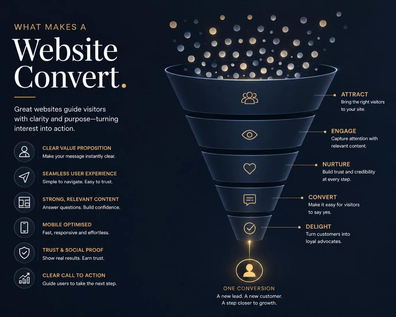
A beautiful website that makes no sales is a costly vanity project. Conversion is what separates a working business tool from an expensive brochure. Conversion means someone visiting your site takes the action you want: booking a consultation, requesting a quote, buying a product, signing up for your newsletter. Without conversion, traffic is just numbers.
Most websites don't convert well because they prioritise looking good over working well. They're designed to impress other designers, not to persuade customers. A converted customer cares about one thing: can you solve their problem? Everything else is noise.
Know Your Customer and Their Question
Before you can convert anyone, you need to know who's visiting and what they want. A web design customer from Birkenhead asking "Can you redesign my site?" needs different information than someone asking "How much does a new website cost?" or "Can you manage my Google ads?"
Different visitors have different questions and different objections. Someone visiting your site for the first time is still deciding if you exist and if you're worth their attention. Someone returning is closer to a decision. Someone who's visited three times and hasn't bought yet has a specific objection you need to address.
Your homepage should immediately answer: What do you do? Who is this for? Why should I care? New visitors should know in ten seconds if they're in the right place. Ambiguity loses conversions.
If you serve multiple customer types, make that clear early. A marketing agency might work with e-commerce businesses and non-profits, and they need very different solutions. Don't make customers dig to find out if you work for them.
Clear Value Proposition
State what you do plainly. Not "Digital solutions for modern businesses" but "We design and build custom websites for independent shops in the North West." Specific beats vague. Vague makes people leave.
What's different about you? Not "We're passionate about great design" but "We include unlimited design revisions and you can keep your existing domain." Specific, concrete differences convert better than motherhood statements.
What's the result? Not "We create beautiful websites" but "Your website becomes a working salesman that converts visitors to customers." Paint the outcome, not the feature.
Back this up with evidence. Not what you think, but what your customers achieved. Testimonials. Case studies. Before and after comparisons. Evidence beats claims.
Remove Friction
Every barrier between visitor and conversion loses customers. A form with twenty fields will convert worse than a form with three. A contact page buried six clicks deep will convert worse than a contact form on every page.
Make your call to action obvious. A website's job is to move visitors toward one clear action. That action should be visible. Not tucked away in tiny text. Not the wrong colour so it blends in. Not ambiguous about what happens when you click.
What happens after they click? If they submit a form, what's next? Do they get a confirmation? An email? A phone call? Uncertainty kills conversions. Tell them what happens.
Reduce cognitive load. Visitors don't want to think about your site. They want to understand your offer. Remove everything that makes thinking harder. Complex navigation. Jargon without explanation. Too much choice. Irrelevant information.
Your site doesn't need a video of your office, background music, or animations that slow everything down. It doesn't need your whole business history or ten customer testimonials when three brilliant ones work better.
Social Proof and Trust
A visitor has never heard of you. They don't know if you're trustworthy. Social proof bridges that gap. Testimonials from actual customers matter. "Brilliant service, finished on time and on budget" from a real business owner matters more than "We're excellent" on your own site.
Case studies matter. Show what you did, what the customer's problem was, what the outcome was. Specificity builds credibility. Real measured improvements beat vague claims.
Social proof doesn't need to be fancy. Google reviews, a customer quote, a logo of a business you've worked with. Real human testimonials in a real human's voice outperform polished marketing copy.
Awards and certifications matter if they're real and relevant. If you're certified in something your customers care about, show it. Irrelevant certifications add nothing.
Page Speed and Performance
If your site is slow, visitors leave. Slow is death. People won't wait ten seconds for your sales pitch. They'll go to your competitor.
Optimise your images. Compress your CSS and JavaScript. Use a content delivery network if you have customers spread across the country. Test your speed regularly.
A slow site also hurts SEO. Google penalises slow sites in rankings. You lose both customers and search visibility. Fast is essential.
A page that's fast feels professional. A page that's slow feels broken, even if it will eventually load. Speed is part of your first impression.
Clear Structure and Navigation
Visitors should always know where they are and how to get where they want. Navigation should be obvious. Categories should make sense. Related pages should be linked.
Heading hierarchy matters. An H1 that describes what the page is about. H2 subheadings that break it into digestible sections. Proper structure helps both search engines and visitors understand your content.
For longer pages, a table of contents helps visitors jump to what matters to them. A sticky menu that stays visible while scrolling helps on mobile.
Too many menu items overwhelm visitors. Prioritise. If you have 15 services, group them into three categories. Make navigation easy, not comprehensive.
Test and Improve
Conversion optimisation is iterative. Small changes compound. A clearer headline, a better-positioned CTA button, fewer form fields, a stronger testimonial. Each change is small, but together they significantly improve results.
Test one change at a time. If you change your headline and your CTA button simultaneously, you won't know which changed the result. Systematic testing beats guessing.
Watch your analytics. Where do visitors go? Where do they leave? Which pages convert best? That data tells you what works and what doesn't.
Ask your customers. Why did they contact you? What nearly stopped them? What made them decide to proceed? Real feedback beats any theory.
Frequently Asked Questions
How do I know if my website converts well?
Track your metrics. How many visitors do you get? How many contact you? What's your conversion rate (visitors divided by conversions)? Compare your results to industry benchmarks. If you're not sure what to track, talk to us about how to improve your website.
Should I focus on more traffic or better conversion?
Better conversion almost always matters more. A website that converts 5 percent of 100 visitors is worth more than a website that converts 1 percent of 1,000 visitors. Focus on conversion first.
What's a good conversion rate?
It depends on your industry and customer type. For e-commerce, 2-3 percent is decent. For B2B services, 5-10 percent might be normal. For something new, even 1 percent is progress. Track your own improvement, not just benchmarks.
Do I need A/B testing?
Not necessarily. Start by making obvious improvements: clearer value proposition, better CTA placement, faster load time, stronger testimonials. A/B testing helps refine, but only after the basics work.
How long before I see results?
Most changes take time to show results. Traffic changes, visitor behaviour changes, seasonal changes. Give a change at least a month before deciding if it worked. Track results consistently so you can spot trends.